What: Copy assistance, design, art
For: Midi Control Comes To Mixing, half-page magazine ad
Client: J.L.Cooper Electronics
When: 1986
What: Copy assistance, design, art
For: Midi Control Comes To Mixing, half-page magazine ad
Client: J.L.Cooper Electronics
When: 1986
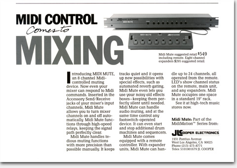
High tech, low budget
The J.L.Cooper Midi Mute
I mention elsewhere in these pages two items which here come into conflict. The first is my penchant for showing products LARGE in the feeling that it conveys importance, openness, vitality, and many other good things in addition to making it easier on the reader to see what’s going on. I also mention that often in advertising we have to make do with pre-existing materials. Here the photo was pre-existing, and quite poor. While I would like to have used it larger, I didn’t dare. And I rationalized that there wasn’t much to see on the product panels anyway. I was still able to create an ad that got noticed and sold product, through a bold, large, and effective headline with a touch of hand-lettering flair. The white space in the lower left helped make this ad stand out in a crowded magazine. The line at the top was to keep the magazine’s text at bay and give our headline and photo some “air.”
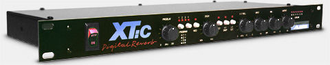
Alesis “XT:c” Digital Reverb
XT:c. Pronounced “ecstasy,” get it? This name sounded clever to Keith Barr when he brought plans for this new product over to me one day for a panel logo design. Can I do it cheap and can I do it right now?, he asked. He had just left MXR and this was to be the first product from his new company, Alesis, of which he was founder and president. Always willing to help an up-and-coming client, I agreed, hoping for a long and fruitful relationship. But Alesis proved to be one of those clients who always called at the last minute and always wanted it cheap, promising more time and fairer budgets to come someday just around the corner. I doubt that they ever did, considering the consistently second-rate advertising and graphics produced by Alesis in the years since.
What: Front panel product logo design
For: XT:c Digital Reverb
Client: Alesis
When: mid-1980s
©Copyright 2008-2021 ericwrobbel.com. All rights reserved.