Designs and Sketches

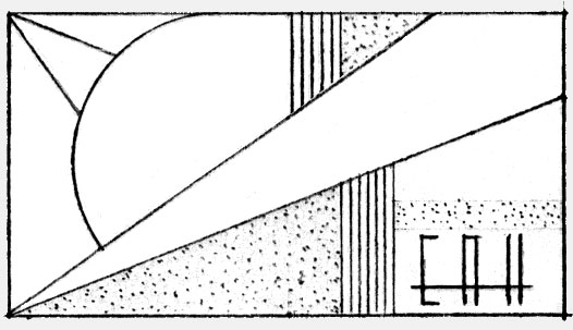
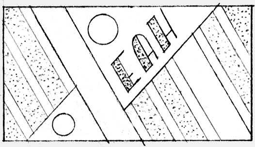
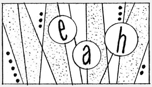
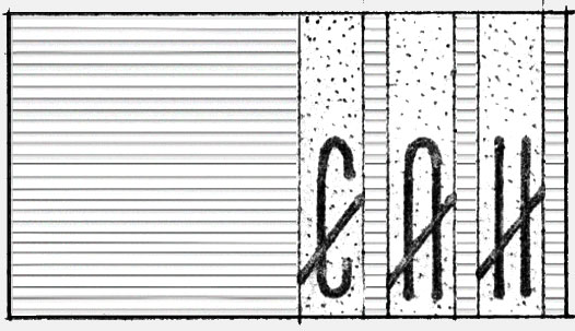
Four designs for a belt buckle to be rendered in silver. There is no added color or finish. Lines and letters indicate engraving. The white areas indicate a polished finish and the gray areas indicate a textured or matte surface.

Client: Erich Hoerchner, 1996

'Back in the day' we sketched designs on paper, worked out the details, and prepared 'comprehensives' for clients to see and evaluate. Here is one of four such 'comps' for a belt buckle to be rendered in silver. There is no added color or finish. Lines and letters indicate engraving. The white areas indicate a polished finish and the gray areas indicate a textured or matte surface. Client: Erich Hoerchner, 1996. More design/comps: https://www.ericwrobbel.com/art/designsandsketches.htm. 'Back in the day' we sketched designs on paper, worked out the details, and prepared 'comprehensives' for clients to see and evaluate. Here is one of four such 'comps' for a belt buckle to be rendered in silver. There is no added color or finish. Lines and letters indicate engraving. The white areas indicate a polished finish and the gray areas indicate a textured or matte surface. Client: Erich Hoerchner, 1996. More design/comps: https://www.ericwrobbel.com/art/designsandsketches.htm. 'Back in the day' we sketched designs on paper, worked out the details, and prepared 'comprehensives' for clients to see and evaluate. Here is one of four such 'comps' for a belt buckle to be rendered in silver. There is no added color or finish. Lines and letters indicate engraving. The white areas indicate a polished finish and the gray areas indicate a textured or matte surface. Client: Erich Hoerchner, 1996. More design/comps: https://www.ericwrobbel.com/art/designsandsketches.htm. 'Back in the day' we sketched designs on paper, worked out the details, and prepared 'comprehensives' for clients to see and evaluate. Here is one of four such 'comps' for a belt buckle to be rendered in silver. There is no added color or finish. Lines and letters indicate engraving. The white areas indicate a polished finish and the gray areas indicate a textured or matte surface. Client: Erich Hoerchner, 1996. More design/comps: https://www.ericwrobbel.com/art/designsandsketches.htm.
'Back in the day' we sketched designs on paper, worked out the details, and prepared 'comprehensives' for clients to see and evaluate. This newsletter design for the CIM Complete investment Management newsletter was going for an old-line big-time Wall Street look. 1988. Accompanying logos and more design/comps: https://www.ericwrobbel.com/art/designsandsketches.htm. 'Back in the day' we sketched designs on paper, worked out the details, and prepared 'comprehensives' for clients to see and evaluate. These three logo designs for CIM Complete investment Management were going for an old-line big-time Wall Street look. 1988. More design, roughs, and comps: https://www.ericwrobbel.com/art/designsandsketches.htm.

The Investment Advisor newsletter design and the three proposed logo designs were for a start-up aiming for that old-line big-time Wall Street look. I rarely had clients this boring. That is to say, my graphics clients were most always in fields that interested me, usually on the margins of the entertainment business. I used to console myself, when having some difficulty with a client, with the notion that "at least they're not a bank"—meaning that at least the work is interesting and not overly constricted and formulaic the way it would be with a bank for a client.

Well, these people were in a "boring" field and yet they gave me the room to have fun with it. I surprised myself, and probably them, how much I could behave myself and do something really quite appropriate to their field.


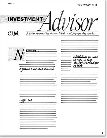
What: Heading design and page layout, sketches

For: Newsletter, preliminary logo designs

Client: CIM (Complete Investment Management, Inc.)

When: 1988


©Copyright 2008-2021 ericwrobbel.com. All rights reserved.