When Black & White Is Right
Often prepared in the “back room” by the technical people, data sheets can be more an impediment to communication than a help. Here a crisp, tasteful layout implies precision and quality, while the text has been de-jargoned and speaks directly to the prospect’s needs. But, I hear some of you say, it’s not color. How can you impart a quality image without color? Well, you’re looking at it. And if you need another example, have a look at an Ansel Adams print. There are situations when black & white is simply right. On items such as these, it is expected and is even appreciated.
What: Copy assistance, design, art, product panel design
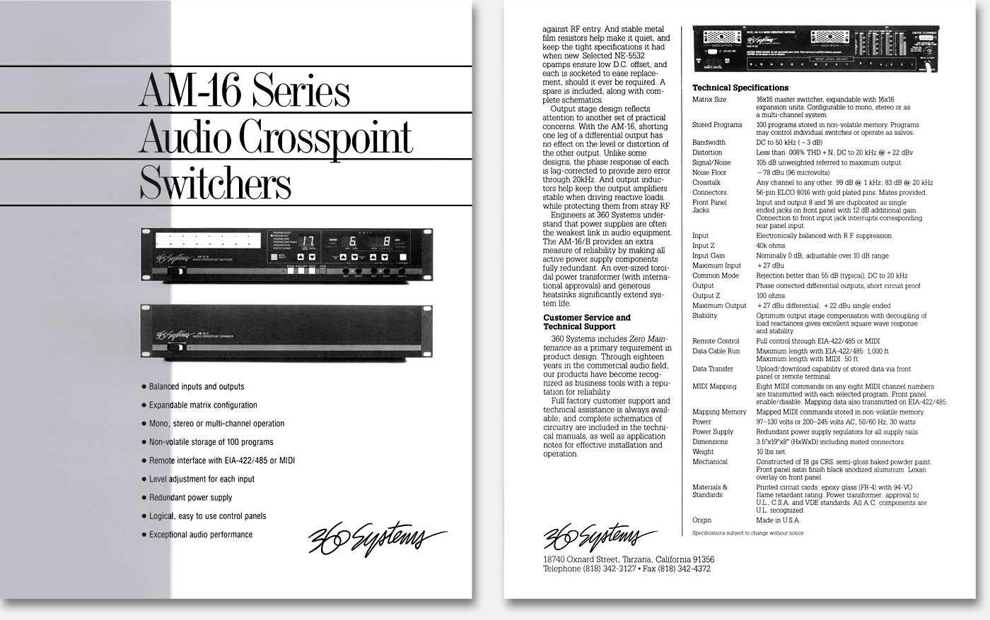
For: “AM-16 Series Audio Crosspoint Switchers” black & white brochure
Client: 360 Systems
When: late 1980s
Why appreciated? Because it implies that you’ve put your money and your effort into substance, not flash. But note this: this concept is undermined when design and layout haven’t received the attention they deserve. They are the things that impart the quality of substance to your communications. If you’re weak there, no amount of flash can save you. Some will employ a second, or “spot” color to make the presentation more “professional.” This usually has the opposite effect and for this reason is often worse than a waste of money. Artfully handled, a second color can be an asset, but this is rare. Given the extra budget, the highly-effective designer can almost always find better ways of increasing readership than using a second color.
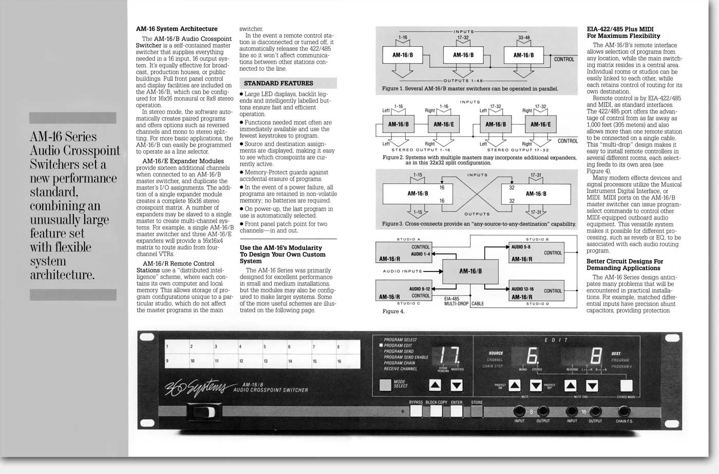
Here in the 17"center spread, the product is shown 13" wide. The actual size is 19" wide. I elected not to go out to 17", as I could have, because that would have been too close to actual size and would have looked odd—as if the product were somehow “not quite right.” My thinking is, life size is great if you can do it, and say it. But if you can’t, make it enough smaller so as not to confuse. Not confusing people is a very big part of this work. See “Layout matters...and idiot-proofing!” for more on this.