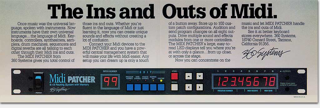
When this ad for the Midi Patcher ran in Keyboard magazine in the late ’80s, it was a joy to behold. I had never seen anyone successfully present any long rack-mounted gear in any of the magazines in which we advertised. So I came up with this ad configuration for my client. With a little coaxing, we got the ad space price of a full page color from the magazine for two side-by-side halves. Wow! Big product! You ought to know by now what I think about that!
I suppose much of the impact is lost here on this webpage, but just imagine turning the pages of the magazine and coming across this spread out across two pages! If you had the slightest interest in midi (and of course you did– you were reading that magazine), this ad grabbed you but good. The product’s front panel would have been hopelessly small and lost in any traditional ad space. But here the interested reader gets to see it all and drool.
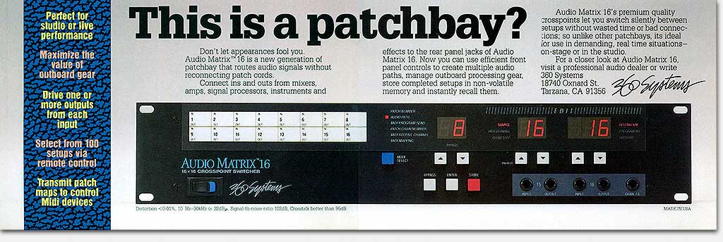
We pulled the same stunt for the Audio Matrix 16 (below). Several “Eric Wrobbel-isms” are present in the design here: the outsize text type that is friendly, clear, and “techie” all at the same time, and the engaging, curious headline that zeroes in on our target market, and of course the larger-than-typical product shot that invites the viewer to read and mentally “push the buttons,” developing an irresistable urge to buy!
What: Concept, copy assistance, design, art, product panel design and logo, corporate logo
For: “The Ins and Outs of Midi” and “This is a patchbay?” half-page color two-page spread magazine ads
Client: 360 Systems
When: 1988