Making excellence out of making do
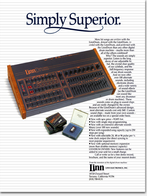
Dealing with existing materials rather than starting completely fresh presents many challenges, yet is often a fact of life in advertising art. In this case, we needed to get another new ad out for the LinnDrum but there was no time for photography. I came up with this solution, removing the background from our previous ad shot, creating a new background, and piecing in a new photo I had taken of the just-launched Alternate Sounds product.
This headline is, admittedly, less than inspired. It’s nothing but bragging. And alliterations don’t impress readers no matter how much advertisers think they do. I suppose the hand-lettered flourish helps a bit. I hope so. Production art of an ad like this might seem simple with today’s technologies, but at the time all of those horizontal lines had to be hand-drawn—with a pen! And that’s not the hardest part. The hardest part is getting the spacing right in between! And how to get the lines under the shadows. All in all, the ad came together well with a fresh, clean look unlike anything then appearing in the magazines in which it ran.
What: Concept, copy assistance, design, art, photo art direction, secondary photography
For: “Simply Superior” full page color magazine ad
Client: Linn Electronics, Inc.
When: 1984
©Copyright 2008-2020 ericwrobbel.com. All rights reserved.