Contrasting craft and machine
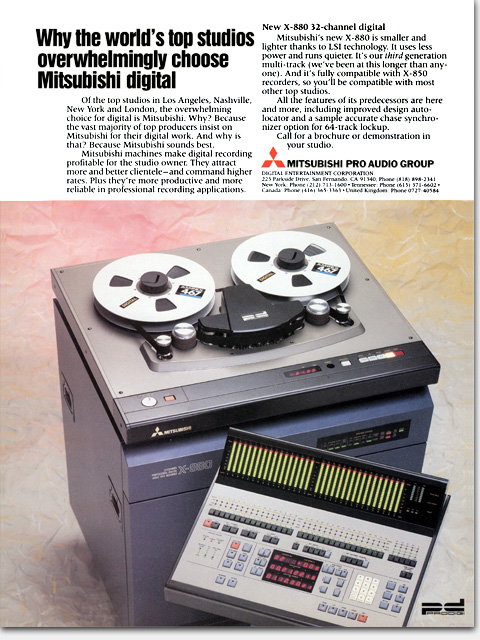
This classic layout made this ad stand out beautifully from the crowded, ugly ads of the competition. Contrasting the extremely expensive precision-crafted machine is the ragged “marbelesque” background. That background is just paper I wrinkled, chalked, and painted at the photo studio. Now that’s art direction!
What: Concept, copy and copy assistance, design, art, photo art direction
For: “Why the world’s top studios overwhelmingly choose Mitsubishi digital” full page color magazine ad
Client: Mitsubishi Pro Audio Group
When: 1988
©Copyright 2008-2020 ericwrobbel.com. All rights reserved.