More hardworking half-pagers
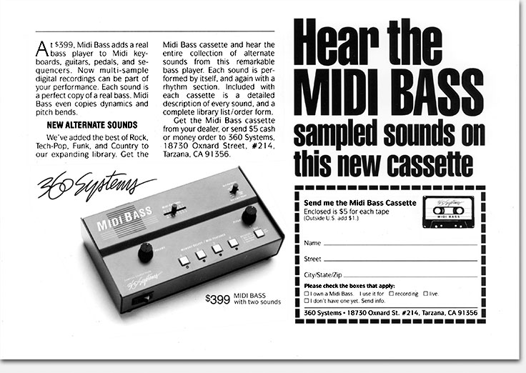
The above ad shows the Midi Bass with a later, revised logo, replacing one which dealers objected to. I didn’t often get to do a coupon in an ad. Though many people in advertising dislike them and consider them “old fashioned,” readers seem to respond. I like the way they remind the client every day when the mail comes that his ads are working.
What: Copy assistance, design, art
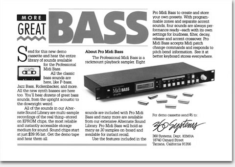
For: “Hear the Midi Bass” and “More Great Bass” half page black & white magazine ads
Client: 360 Systems
When: 1985 (top), 1988 (bottom)
Though at the time 360 Systems was a small concern, for gaining and holding the respect and trust of potential buyers it was imperative that they look “big time” at all times. I never lost sight of that. Curiously, that put me at a disadvantage at times with my client. Third-party critics, in or out of the company, could easily put down my work as “dull” and “corporate” while showing the racysexyarty stuff they would propose. In the short term, that always looked appealing. To Bob Easton at 360 Systems, one of my all-time favorite clients, I take off my hat in salute for resisting those critics and their naïve notions for so long.
©Copyright 2008-2021 ericwrobbel.com. All rights reserved.