What: Copy assistance, design, illustration,art
For: “Link Your Midi Instruments” and >“Smart Patcher,Smart Price” half page black & white magazine ads
Client: 360 Systems
When: 1986 (top), 1988 (bottom)
Hardworking half-pagers
The half page black & white magazine ad can be an excellent space buy if you prepare it well. But beware! The limitations in this humble format have been known to bring out the worst in designers, both good ones and bad ones. The good because they think they can’t be bothered, and the bad because the challenge is beyond their skills. (I could argue that the “good” can’t be bothered precisely because they fear it is beyond their skills too!)
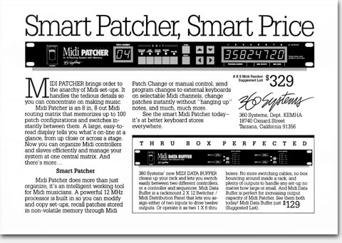
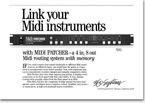
What: Copy assistance, design, illustration,art
For: “Link Your Midi Instruments” and >“Smart Patcher,Smart Price” half page black & white magazine ads
Client: 360 Systems
When: 1986 (top), 1988 (bottom)
I almost never use outer borders in partial page advertising. Why waste space building a fence? Especially a fence that basically proclaims, “this is an ad, stay out!” But in the case of the “Link your Midi instruments” ad above, which was to appear in a magazine notorious from cramming things too close together, even intruding into our paid space, I used a single line border at the top to force some space there, some “air,” before our headline. I can see them in the composing room at the magazine: “What’s this line here? Let’s get rid of it.” No, you don’t, bud, we paid for that line and we have our reasons.
©Copyright 2008-2021 ericwrobbel.com. All rights reserved.